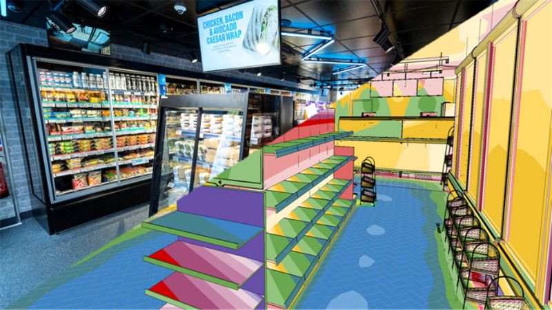
Co-op recently announced the Co-op On-the-Go stores. The innovative micro store format is compact, agile, and designed for high-footfall locations - a bold step forward in retail innovation and customer experience.
This project started with what looked like a straightforward brief: develop a lighting concept for a new store formal: Co-op grab-and-go. But very quickly, it became clear this wasn’t going to be a typical retail lighting job. And I was so ready for this one as I could tell this will be a job full of collaboration, teamwork, great ideas and so much for me to learn!
It wasn’t just about illumination, or even efficiency. It was about using light as a design language, something that could carry brand identity, shape atmosphere and define how people perceive the space before they even step inside. Almost, making them want to come in!
From the beginning, the ambition was bigger than the technical brief. Co-op wanted a new kind of retail experience that could sit in the fast-moving world of grab-and-go food, across the wider UK high street. But it still needed to feel unmistakably Co-op. That’s where lighting became central to everything.
Lighting as the First Expression of Brand
What stood out early on was how heavily the project relied on lighting to communicate brand identity. There wasn’t a huge reliance on signage or graphic branding in the way you might expect from a typical retail rollout. Instead, the brief leaned into atmosphere of how the space feels, how it pulls people in and how it behaves visually in a busy urban environment. Lighting had to do a lot of the heavy lifting.